Design for Stationery
Dante Gabriel Rossetti
1863
Production Description
Production Date: 1863
Electronic Archive Edition: 1
File Name:
sa831.rap.xml
Scholarly Commentary
Introduction
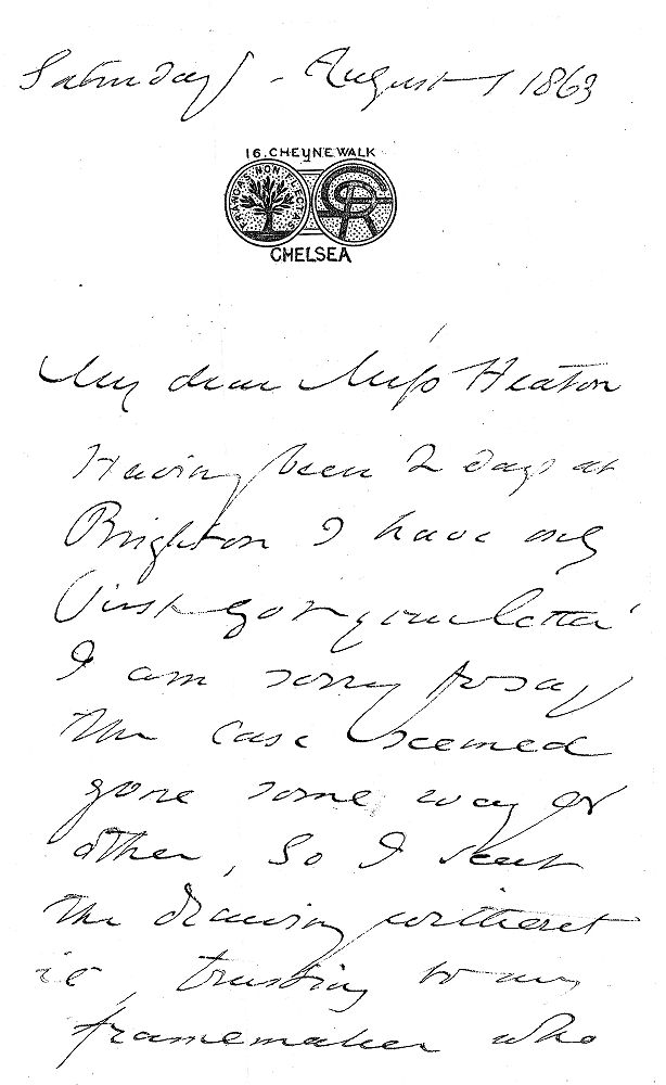
DGR's distinctive design for his stationery first appeared in a 1 August 1863 letter to Ellen Heaton (Fredeman, Correspondence, 63.78). The note paper, with its embossed crest reading FRANGAS NON FLECTAS and the stylized monogram, subsequently became DGR's favored writing material for his correspondence.
Production History
The note paper and the cast die with monogram were executed in 1863 per DGR's design instructions by the stationery and engraving firm Jenner & Knewstub, 33 St. James Street and 66 Jermyn Street, London. DGR's studio assistant and pupil, W.J. Knewstub, took the initiative in having his brother's firm produce the stationery “gratis” (Fredeman, Correspondence 63.79, 63.80, 63.82).
Jenner & Knewstub produced the initial run of stationery in a variety of colours (Fredeman, Correspondence 63.82). Later requests to Knewstub make clear DGR's favouring of the “grey monogramm'd paper” (Fredeman, Correspondence 67.170). In addition, a detailed order for more stationery, sent to Charles Augustus Howell in 1872, shows that DGR preferred “a thinner, slightly-ribbed, and quite unglossed paper, like the first lot Jenner & Knewstub made” (Fredeman, Correspondence 67.172).
Reception
DGR's correspondence from this time shows the pleasure that he took from Knewstub's “gift” (Fredeman, Correspondence 63.80). In a letter to William Allingham, DGR recalls with fond humour Knewstub “insisting on making me the present of a stack of paper headed in various colours, which stuff up every drawer in my studio & will last half my lifetime,—or indeed perhaps head the news of my death when that occurs, before the black edged paper has arrived” (Fredeman, Correspondence 63.82).
Iconograpic
The design clearly means to represent the reverse and obverse sides of a coin, with DGR's initials folded in an elegant arabesque design that anticipates the simplicity of art nouveau. The tree on the reverse is the traditional icon for something that bends but does not break—which is curious since the proverb is given in its stoic rather than its medieval version (see commentary below). The structure of the design recalls the rondels that DGR used on many of his decorative frames, as well as the coin design worked into the illuminated text of the “Sonnet on the Sonnet”.
Literary
“Frangas non flectas,“ the phrase chosen by DGR for his stationery, may be translated: “You may break but not bend me.” It is a slight variant on the ancient Latin proverb “Frangas non flectes,“ (with the verb in the future tense). Perhaps even more familiar is the medieval variation on this stoic thought to the effect that “I bend but I do not break“ (see e.g. La Fontaine, Fables I. 22).
Autobiographical
WMR refers to this tag as the “family motto” in his introduction to the Poetical Works of Christina Rossetti. He addressed the source of his brother's motto at greater length in Family Letters : “Whether the Rossettis (or possibly I should rather say the Della Guardias) really have any armorial bearings is a matter unknown to me. My father owned (brought, I suppose, from Italy) a largeish seal marked with a crest—a tree having the motto Frangas non flectas—and he said this was regarded as his crest. Mr. Knewstub, my brother's art-assistant, who was connected with the Firm of Jenner and Knewstub, got that firm to present to Gabriel a die with the crest and a monogram; and the latter for some years habitually used note-paper thus stamped” (2.187).
Bibliography